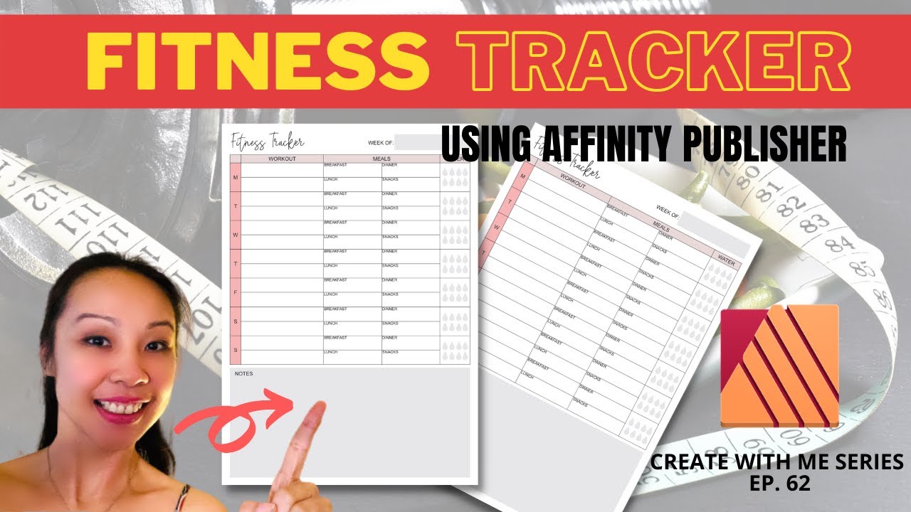
Create A Planner Using Affinity Publisher

This is an excellent video, but a much faster way to duplicate lines and other elements is to select an element or group of elements, move it to where you want, then keep ‘CTRL’ held down on your keyboard while clicking ‘J’ as many times as you need to, like in this video:

I’ve made several planners using Affinity Publisher, it’s really great fun to design something original, but I have no shame in admitting that I’m still just learning and often search for tutorials on using the software.
There are so many niches out there that you can create planners, logbooks and other things for. I made a wedding planner, and though I took inspiration from a downloaded file from Creative Fabrica, it was made from scratch and took a long time! It was created in black and white or it would cost a lot more to purchase, as this colour planner does!
By all means, take inspiration from other planners and journals, but do put your own, original spin on your creations or you could be accused of copyright infringement and your account could be banned from Amazon for duplicate content among other things!
You could create things like:
- Appointment books for specific occupations
- Gardening logbook
- Recipe books
- Wine and food review books
- Dog walking logbook
- Restaurant booking system
- Prompt journals
- Mental health trackers
- Slimming trackers
- Hiking and camping logbooks
- Real estate ledger
- Accounting and business planners
- Inspirational colouring books for adults
The list of things you can create is literally endless!
